
Smarthistory
A usability study to improve mobile navigation for users interested in European and modern art history.
My Role
UX Researcher. Focused on task design, test facilitation, findings 1 and 5, and recommendation 4.
Methods
Behavioral analytics, eye-tracking, Retrospective Think Aloud (RTA)
Tools
Google Analytics UA, Hotjar, Tobii Pro, Excel, Figma
Team
Cathy Hu, Sandy Leegumjorn, and Anyelina Wu @ Pratt Center for Digital Experiences
Timeline
8 weeks
(Feb.–May 2023)
Overview
Smarthistory supports the equitable and inclusive study of art history by working with scholars and knowledge-bearers to create and distribute free, original learning resources.
Smarthistory wants to ensure their content organization reflects a non-traditional view of art history that moves against the typical emphasis of Western art and siloing art movements by geography. They want their navigation to be flexible, robust, and reflective of complex connections across place and time.
Their problem
To provide the groundwork for future content organization changes, Smarthistory wants to understand how users access and navigate between different types of content on the current website, and any issues they experience along the way.
Our focus

Current mobile Smarthistory homepage.
Timeline
Our class split into four teams to tackle different devices (Desktop vs. Mobile) and topic areas (non-Western vs. European and Modern art history pages). Our team focused on the mobile European and Modern pages.
Our research involved behavioral analysis of web users with Google Analytics and Hotjar data, Tobii Pro eye-tracking tests with Retrospective Think Aloud (RTA) for eight recruited participants, and System Usability Scale (SUS) surveys.
To our client, we handed-off a final presentation of key findings and recommendations, mock-ups and suggestions for A/B tests, and a problem list of our full findings synthesized using the rainbow sheet method.
01
Kickoff
Feb. 8, 2023
➜
02
Behavioral Analysis
➜
03
Midpoint
Mar. 8, 2023
➜
04
Eye-tracking Tests and Analysis
➜
05
Hand-off
May 3, 2023
Methodology
01: Kickoff Meeting
Our class met with the client to understand their goals, ask questions, and begin outlining our research focus. From this meeting, we developed research questions to guide our work:
How are users using the navigation system to find what they are looking for?
What are the characteristics of a typical user visit?
What are the main pathways users take in order to find the information they need?
How effectively do pages inform users of existing content, and is their structure intuitive for users?
How does site navigation differ based on user goals?
02: Behavioral Analysis

Hotjar screenshot showing heatmap of taps on the mobile Smarthistory homepage.
We analyzed Google Analytics data from February 14, 2022 to February 14, 2023, and Hotjar data from February 9 to 28, 2023, to understand how users access and interact with the mobile Smarthistory website.
The quantitative data we found not only helped us answer research questions; it also surfaced areas for further investigation in eye-tracking sessions, such as:
Are users having trouble finding and using the hamburger and bottom navigation?
Why do users seem to prefer the search button?
How do users navigate between content pages?
How do users discover landing pages?
03: Midpoint Meeting

Initial A/B test mockup to decrease scroll fatigue on content pages. Based on Hotjar findings that only 25% of users scrolled to content pages’ bottom navigation.
We presented our initial findings to the client, shared ideas for A/B testing, and received feedback on our work so far. Feedback was positive, and our initial findings were later reaffirmed and expanded upon during eye-tracking tests.
Our initial findings involved:
Typical mobile user visits: Few mobile users seem to discover the bottom navigation or landing pages.
Engagement trends: Mobile users tend to spend very little time on the site.
Visuals: The mobile version of the site missizes images on content pages, making scrolling unpolished.
Navigation features: Mobile users seem to experience responsiveness issues with the search, hamburger, and bottom navigation menus.
04: Eye-Tracking Tests and Analysis
To expand on our quantitative behavioral analytics research with qualitative data, we designed an eye-tracking test with five tasks, outlined below. This would allow us to directly observe participants navigating through areas of the mobile Smarthistory website we found problematic or interesting in our initial research, and receive their feedback. We supported these tests with Retrospective Think Alouds (RTAs), which asked participants to watch a replay video of their gaze recording and answer questions about the thoughts and feelings they had as they navigated through a page, and a post-test questionnaire, which incorporated qualitative questions and the System Usability Scale.
We recruited and ran tests with eight participants who ranked themselves as having low-to-moderate familiarity with art history, which correlates them with the art history student and art enthusiast user groups they hope to serve. After the tests were complete, we condensed and analyzed our findings using the Rainbow Sheet technique.
05: Handoff
After analyzing our data, we chose the most severe and pervasive findings to address with recommendations our final, handoff presentation to Smarthistory. To ensure Smarthistory has as much information as possible to move ahead with and expand upon our original research, our final presentation includes links to our:
Eye-tracking tasks
Post-test question responses
Problem list
Mid-point presentation
Figma mockups (with PDF exports)
Overall Findings
Test participants thought Smarthistory images and content were trustworthy and captivating.
“I thought the information on this website is well researched and useful.”
“The pictures grabbed my attention.”
Participants also liked the bottom navigation.
“This was actually something I was looking for (...) often, a lot of catalogs have indexes.”
“It's easy to see the overall structure of the site by looking at the bottom nav.”
However, impressions of the site as a whole were less positive. Smarthistory has a below average System Usability Scale (SUS) score. Their score correlates to a “Not Acceptable” rating on a scale of Best Imaginable to Worst Imaginable.
68
Average SUS Score
7.05%
of other websites have a lower SUS score than Smarthistory
42.5
Smarthistory’s SUS score
These findings offer Smarthistory a clear opportunity to improve.
Our full report provides five key findings to understand Smarthistory’s mobile user experiences, and four recommendations to improve those experiences.
Findings
Typical visits include search options, content pages, short sessions, and missed landing pages
Users need guides to navigate and digest information
Users are confused by page organization and labels
Responsive navigation issues frustrate users
Users enjoy, but can’t find, bottom navigation
Recommendations
Add introductory content to the homepage and content pages
Rename and add new sections in the hamburger menu and landing pages
Refine navigation systems to meet mobile responsiveness standards
Move bottom navigation to top and conduct A/B testing
Finding 01
Typical visits include search tools, content pages, short sessions, and missed landing pages.
The search bar is the most popular navigation option.
Most users arrive from search engines.
How does use of search impact user visits? It may lead to quick discovery of content pages, low discovery of landing pages (such as those for geographic areas), and quick exits.
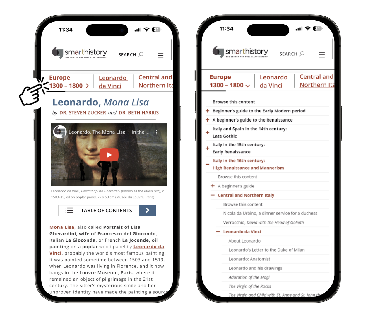
Content pages are the most popular.
Content pages (such as this page about the Mona Lisa) feature individual essays and videos about artwork.

Screenshot of a content page about the Mona Lisa on mobile.
Users quickly leave the site.
In eye-tracking tests:
100% used the search bar
75% used the hamburger nav.
63% used the bottom nav.
50% used homepage thumbnails
In Google Analytics:
73% come from search engines
22% come from direct links
2.6% come from referral sites

81.5% of users visit
only 1 page

81.5% visit for less
than 10 seconds
Why aren’t users digging deeper? Tied with low bottom navigation use, it may be caused by low discovery of landing pages.
Users do not frequently visit European & Modern landing pages.
Combined, the six landing pages receive .39% of total mobile pageviews.
When they do visit, they most frequently arrive via the home page.
50% of landing page visitors arrive from the homepage. These visitors may most frequently use homepage thumbnails.
22% of landing page visitors arrive directly from a search engine.
Recording of user’s first visit to Smarthistory as they navigated to a landing page attempting to find information about the Mona Lisa. 1.5x speed.
Finding 05
Users enjoy, but can’t find, bottom navigation.
75% of users think bottom navigation is easy to use.
50% of users expected to find something like it during their visit.
“Especially when stuff is interconnected (...) it makes it very intuitive and helpful.”
“It’s easy to see the overall structure of the site just by looking at the bottom nav.”
“This was actually something I was looking for (...) a lot of catalogs have indexes.”
Users who tested the mobile non-Western art pages experienced much lower levels of satisfaction using the bottom navigation. This may be caused by different structuring methods for the bottom nav. on the non-Western vs. European and Modern pages.
The mobile non-Western team noted that their bottom navs. seemed inconsistently organized by location or time, making it hard for users to predict and understand. However, the European and Modern bottom nav. tend to be organized more consistently. Our users spent the most time with the Europe 1300–1800 bottom nav. whose main sections drill down by location and time, location, then individual artists.
While 63% of participants used the bottom navigation during the test…
…only 12.5% (one user) thought it was easy to find.
"When you come across additional resources, you think the page has ended (...) I didn't think there was any more information left for me to skim through."
Recording of quoted user scrolling up as soon as they saw the “Additional Resources” section.
50% of users suggested moving the bottom nav. to the top of the page.
“I wish the bottom nav were at the top of the page.”
“The topics and guides would be more helpful if placed at the top of the page like in Wikipedia.”
Recommendation 04
Move the bottom navigation to the top and conduct A/B testing.
It’s the same navigation — but easier for users to discover.
This new navigation bar shows the section the user is in (Europe 1300–1800), and provides a scrollable breadcrumb trail of clickable links to the subsections this particular content page is nested within.
Clicking the section name opens the full navigation menu, containing the same interactions currently included on the website.

Mockup of new top navigation. Swiping left on top nav. bar will show additional subcategories. Nav. is sticky and follows user as they scroll down.
Inspired by NYTimes; see mobile version of articles on Russia-Ukraine War.
Run an A/B test against the current bottom navigation menu to understand the effectiveness of this solution. To measure effectiveness, track increases for the following metrics:
Pageviews on the six landing pages
Currently, pages comprise .39% of mobile pageviews.
Average session duration
Currently, 00:01:44 session duration; 81.5% of sessions last < 10 seconds.
Average pages per session
Currently, 1.47 pages per session; 81.5% of sessions visit only 1 page.
An increase in pageviews means that more people are discovering landing pages. An increase in session duration and average pages per session means that more users are diving deeper into the site’s content.
Key Takeaways
To conclude, we emphasized the importance of Smarthistory’s SUS score as a benchmark for where they are now, and how any improvements to their current site change its usability for the users it seeks to reach and impact.
Feedback was positive, and emphasized the potential of our recommendations to improve the experience of Desktop users, too.
“These are all really good insights and ideas.
“It just strikes me that (...) changing the way that someone is looking at what we have [in our navigations] (...) might be percolating across Desktop as well.”
When you need to focus on a particular aspect of a website, don’t ignore the bigger picture.
It wasn’t until the night before our presentation that we were able to preview the Mobile non-Western team’s findings. Their test participants had a drastically different experience with the bottom nav. than my group’s. Our participants enjoyed it, but their participants found it confusing and hard to use.
It clicked during their final presentation, given before ours, that might be due to differences in how Smarthistory organizes non-Western vs. European and Modern art. I slid in a mention of this when it was our turn to share our findings.
One of my peers in the non-Western group sent me a note afterwards that they really appreciated my attempt to bridge the gap between our research.
Bridging these gaps makes all our work to support a client stronger. In future projects that are split like this, ensuring I build early opportunities to share ideas with other teams is a priority.
Look for inspiration elsewhere.
As we developed our midpoint recommendations, we looked for inspiration at our favorite websites that help us navigate complex, interconnected topics like Smarthistory does. Wikipedia’s article pages and The New York Times’ articles on the Russia-Ukraine War were the most influential, helping us redesign the bottom navigation and content page.
In our post test questionnaires, we learned Wikipedia was also on participants’ minds as they navigated through Smarthistory. We learned they also thought of the solutions Wikipedia offers as they experienced difficulty here.
I immediately thought this was similar to Wikipedia in some ways. Though it is more difficult to find exactly what you're looking for (…) with limited ways to navigate to more precise information (ex. Wikipedia links specific articles in-text).
With participants comparing their experience on a new site to their experiences on others, looking for best practices elsewhere will help users spend less time learning something new and more time interacting with the content they need.